Color Stories: Red, Milan Design Week 2026
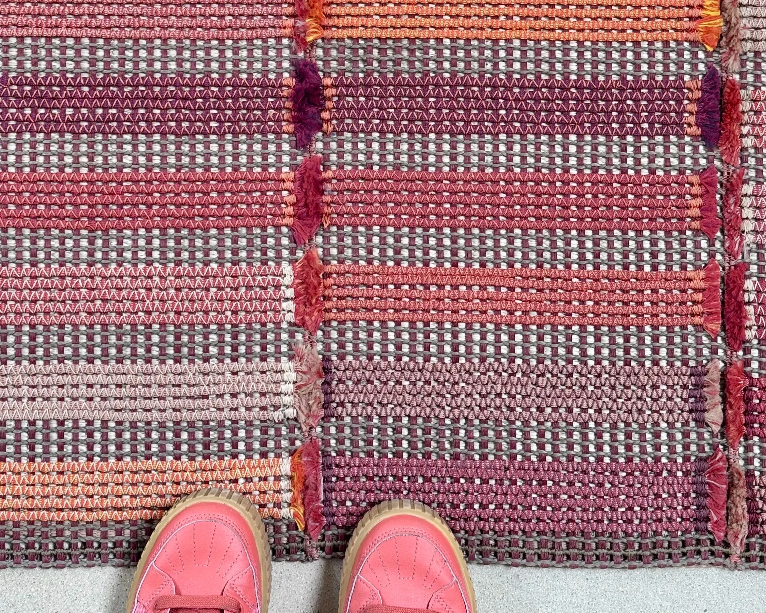
Woven rug by @paola_lenti_official
A bit belated, but I spent a lot of time color hunting during Milan Design Week this year. Here are a few (mostly) reds that stood out.
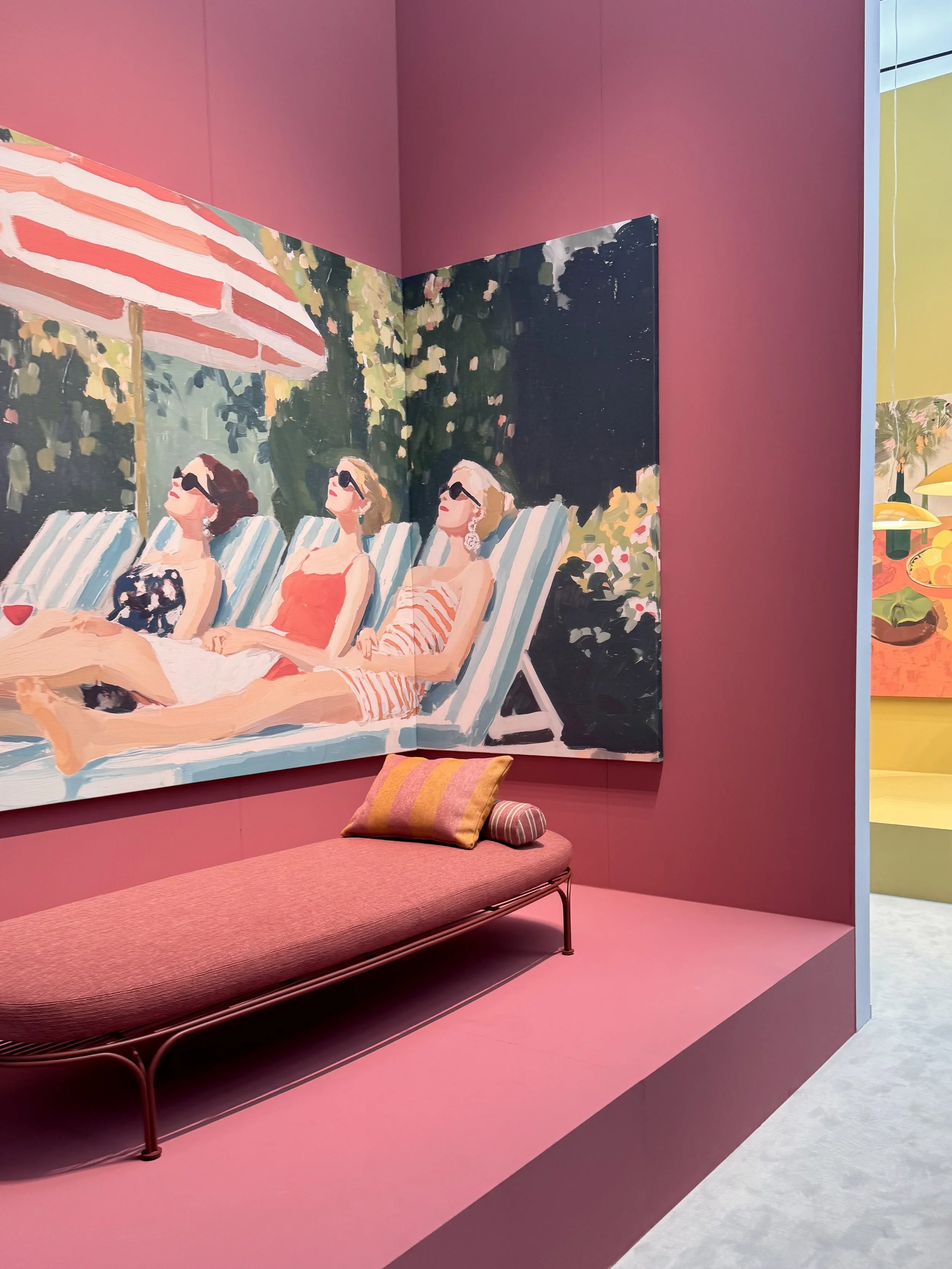
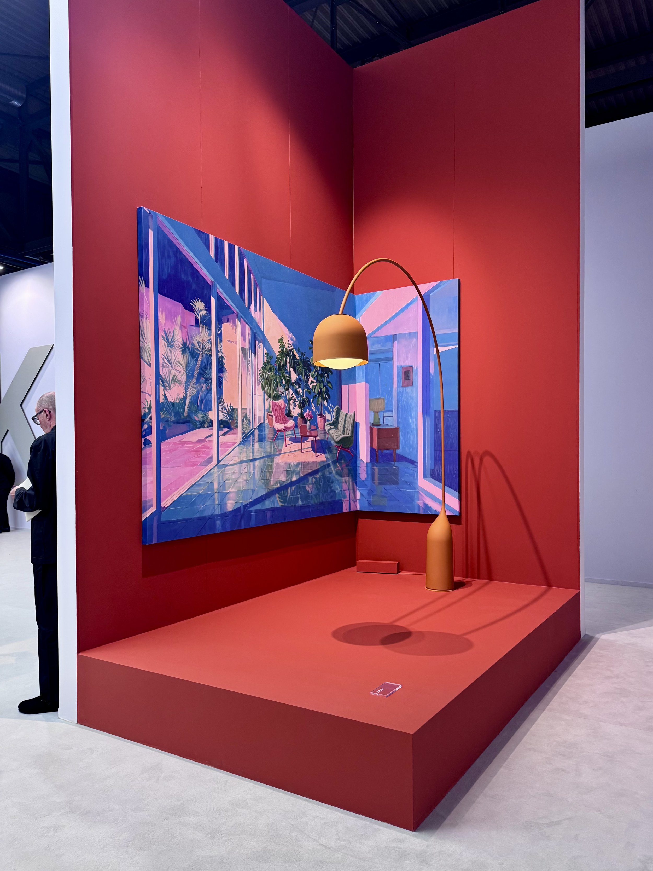
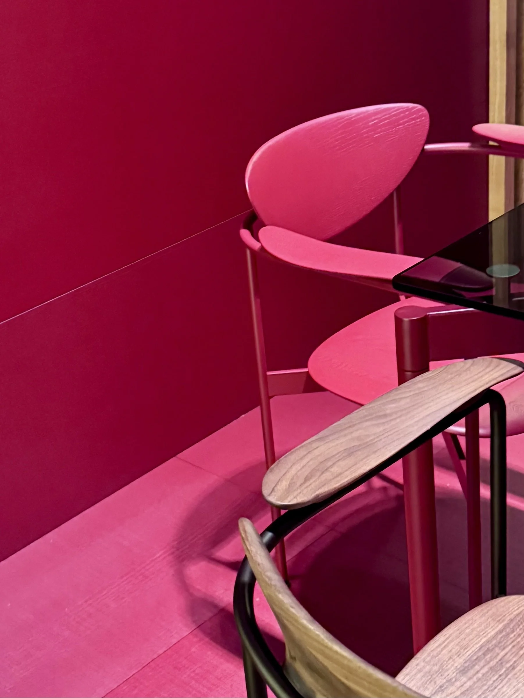
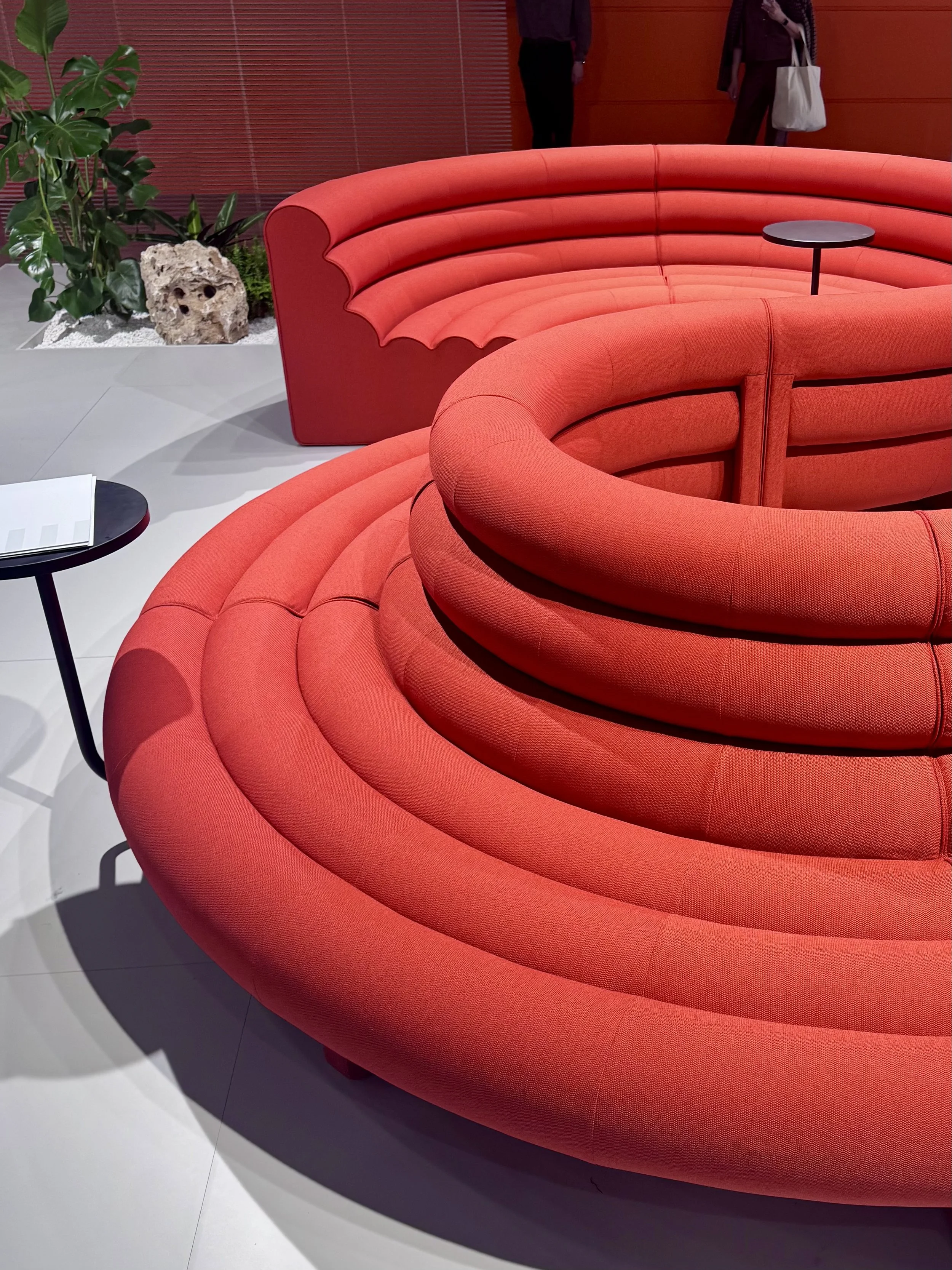
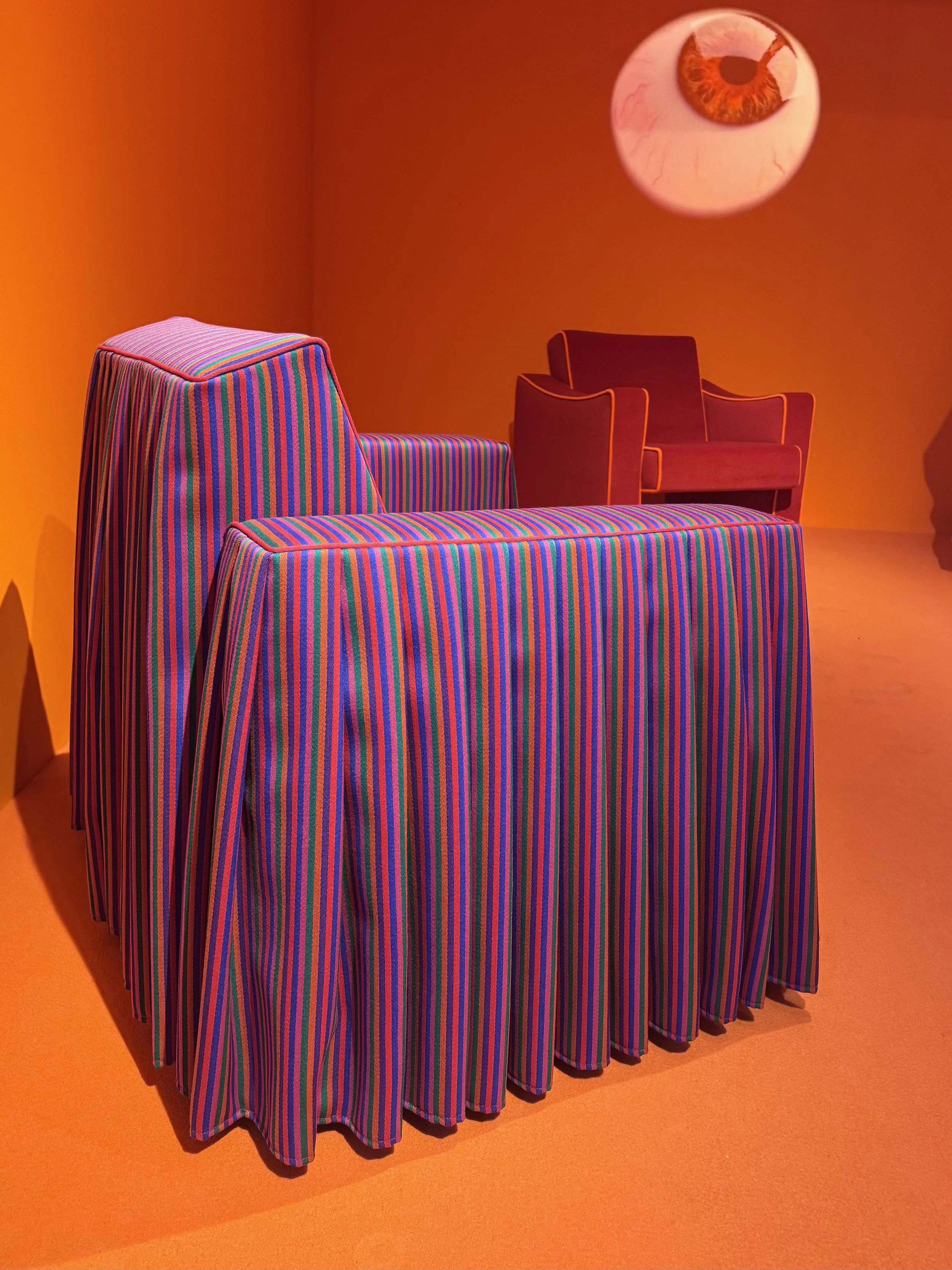
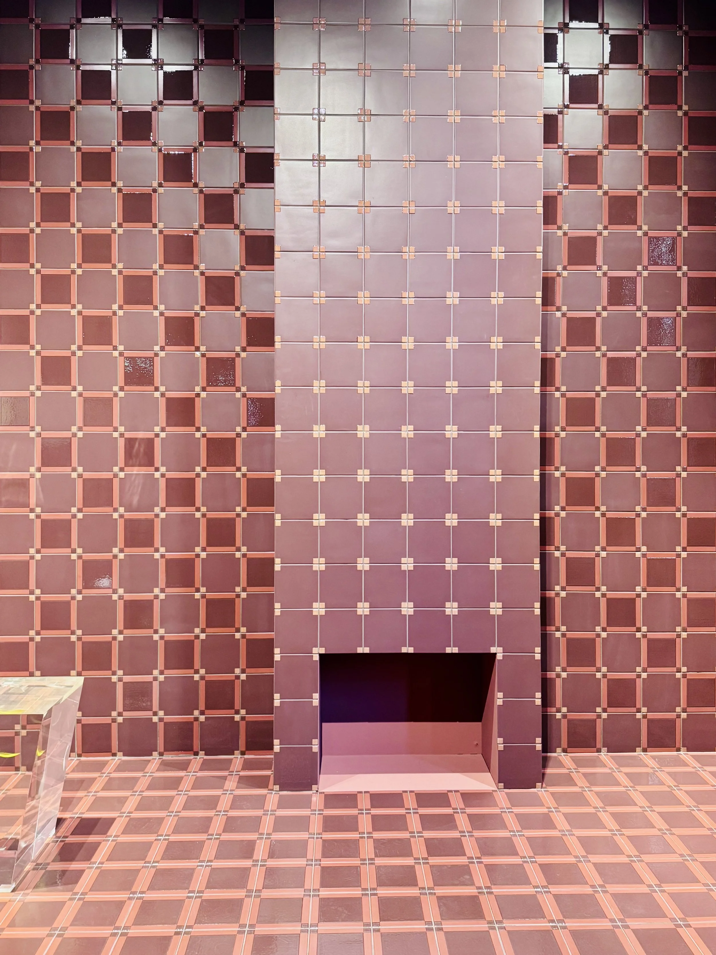
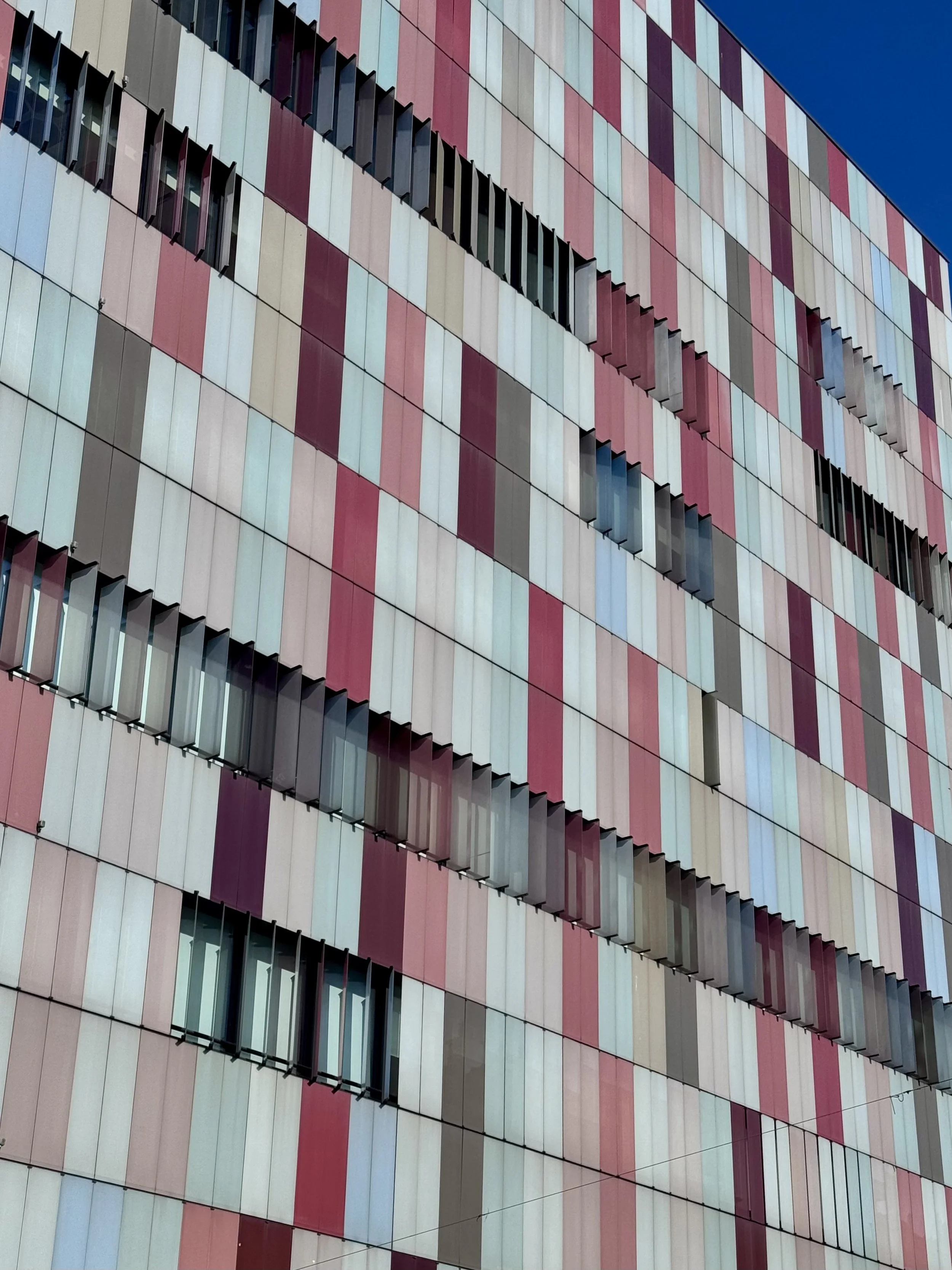
From saturated, almost lacquered finishes to softer earth tones, reds shifted between detail and environment. They translated across materials, from textile to tile to coated and painted surfaces.
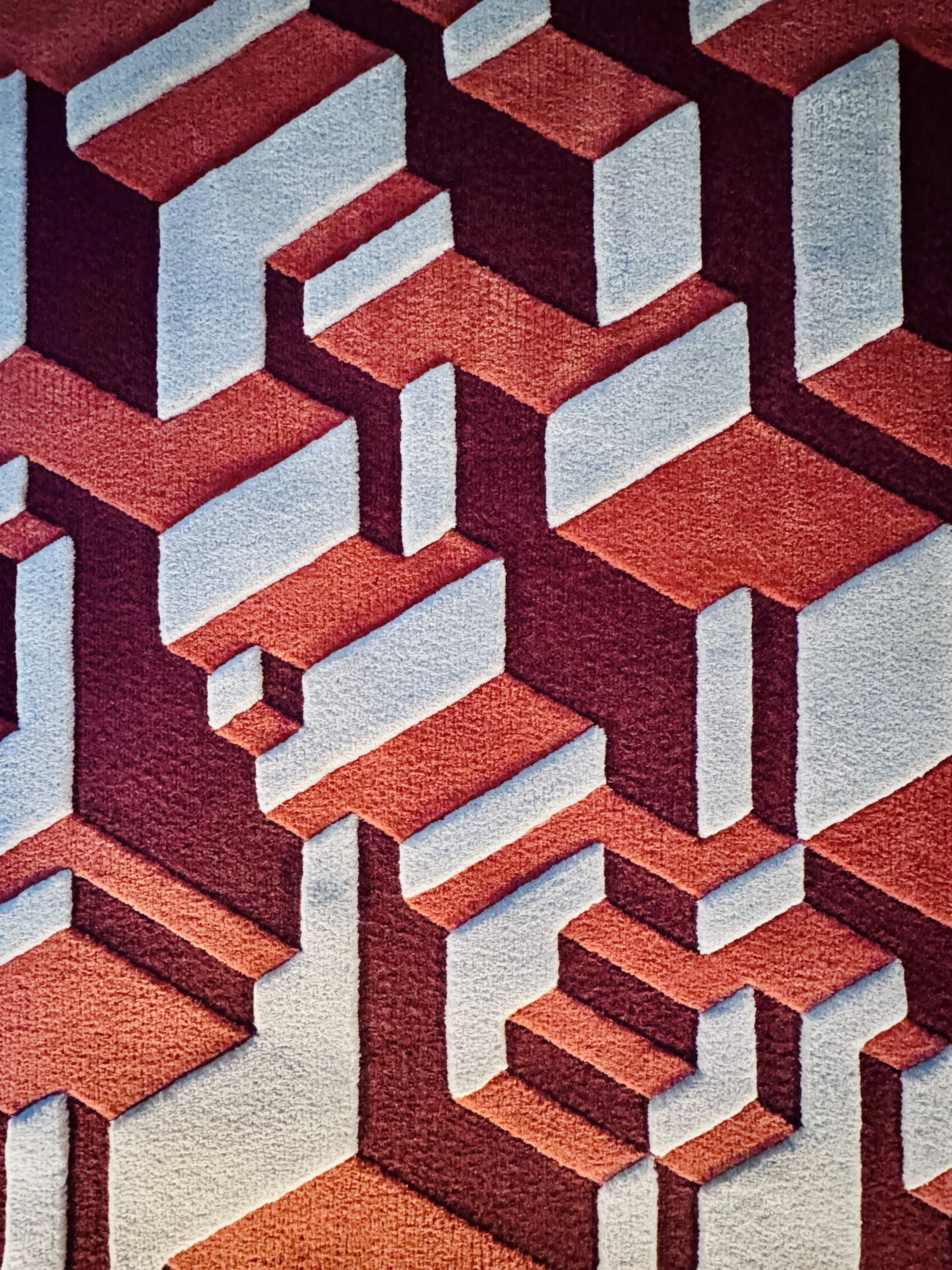
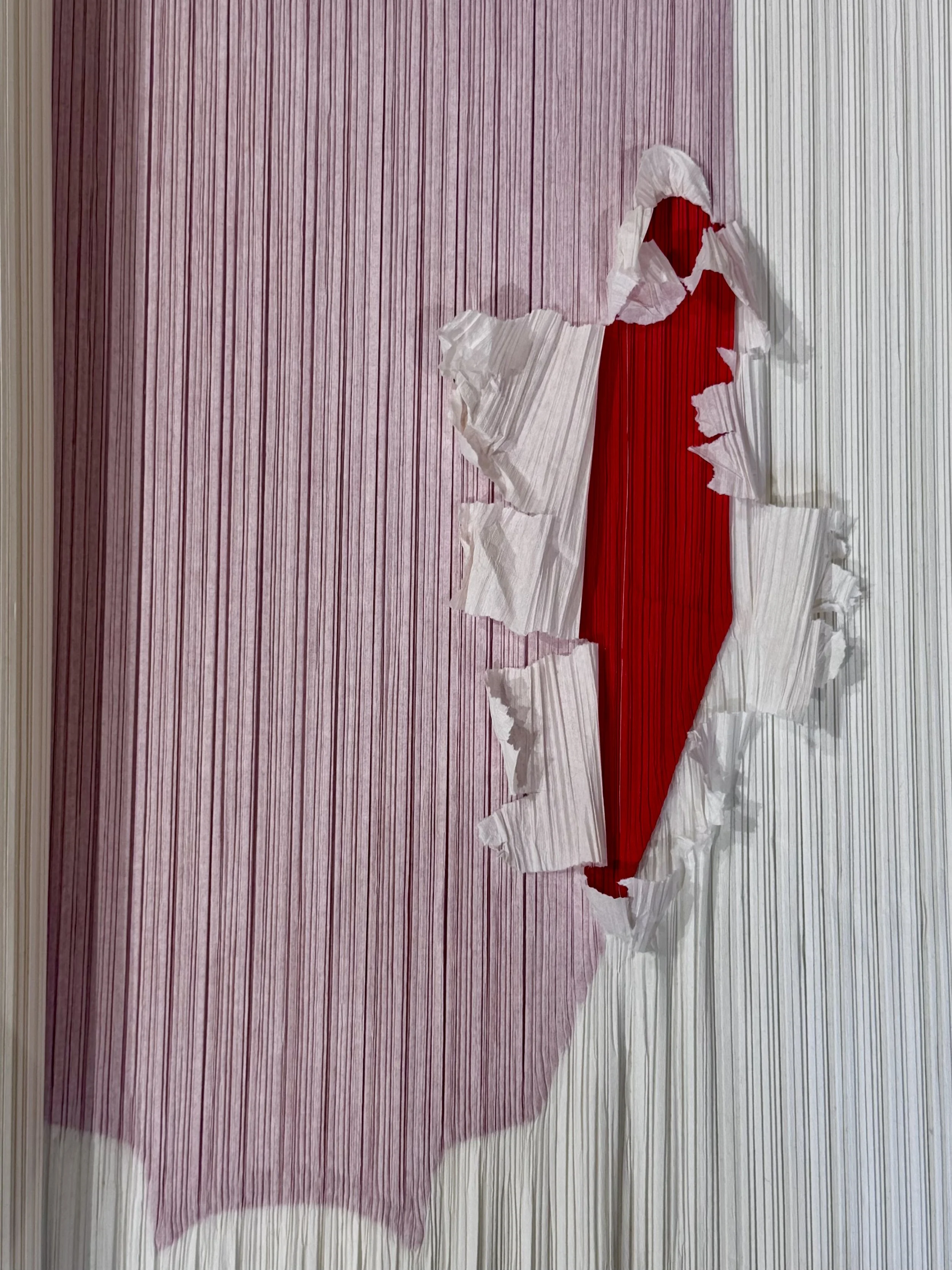
What stayed with me most was the range. Some reds felt graphic and high contrast, while others leaned mineral, faded, or almost sunbaked. The same color family moved easily between woven textiles, glossy installations, pleated paper studies, tiled surfaces, upholstery, and stitched details.
In some moments, red defined the object. In others, it became atmosphere.
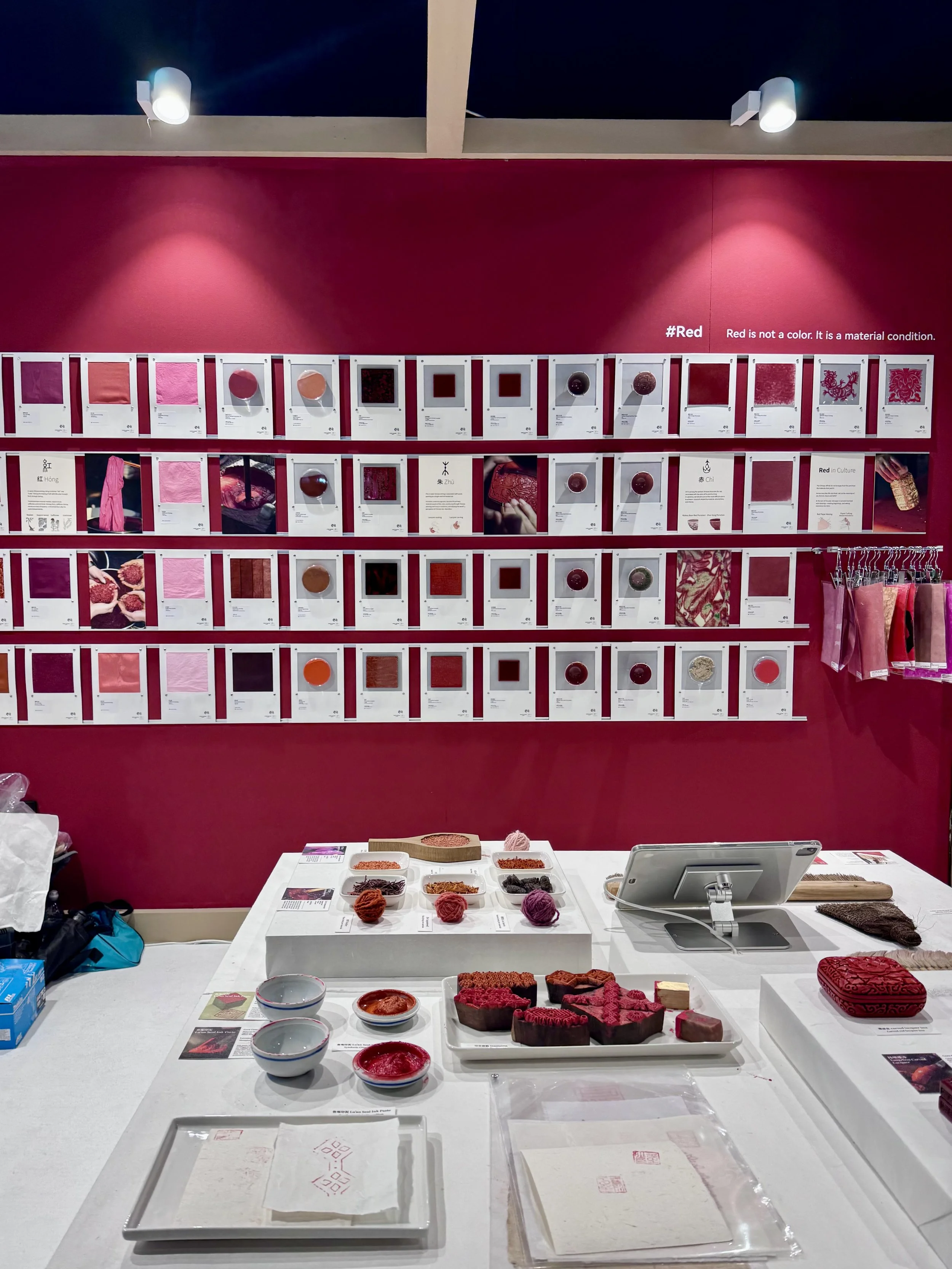
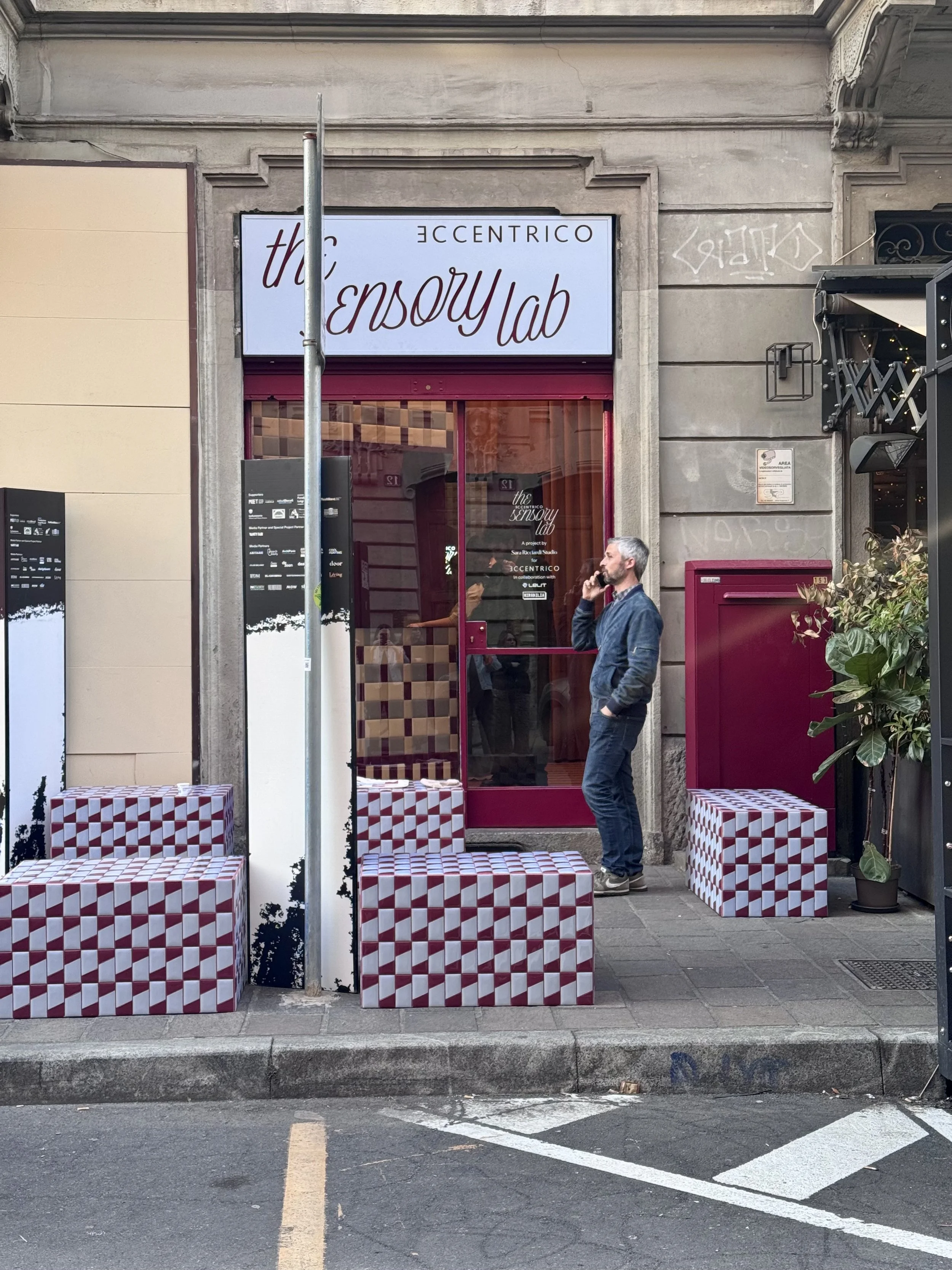
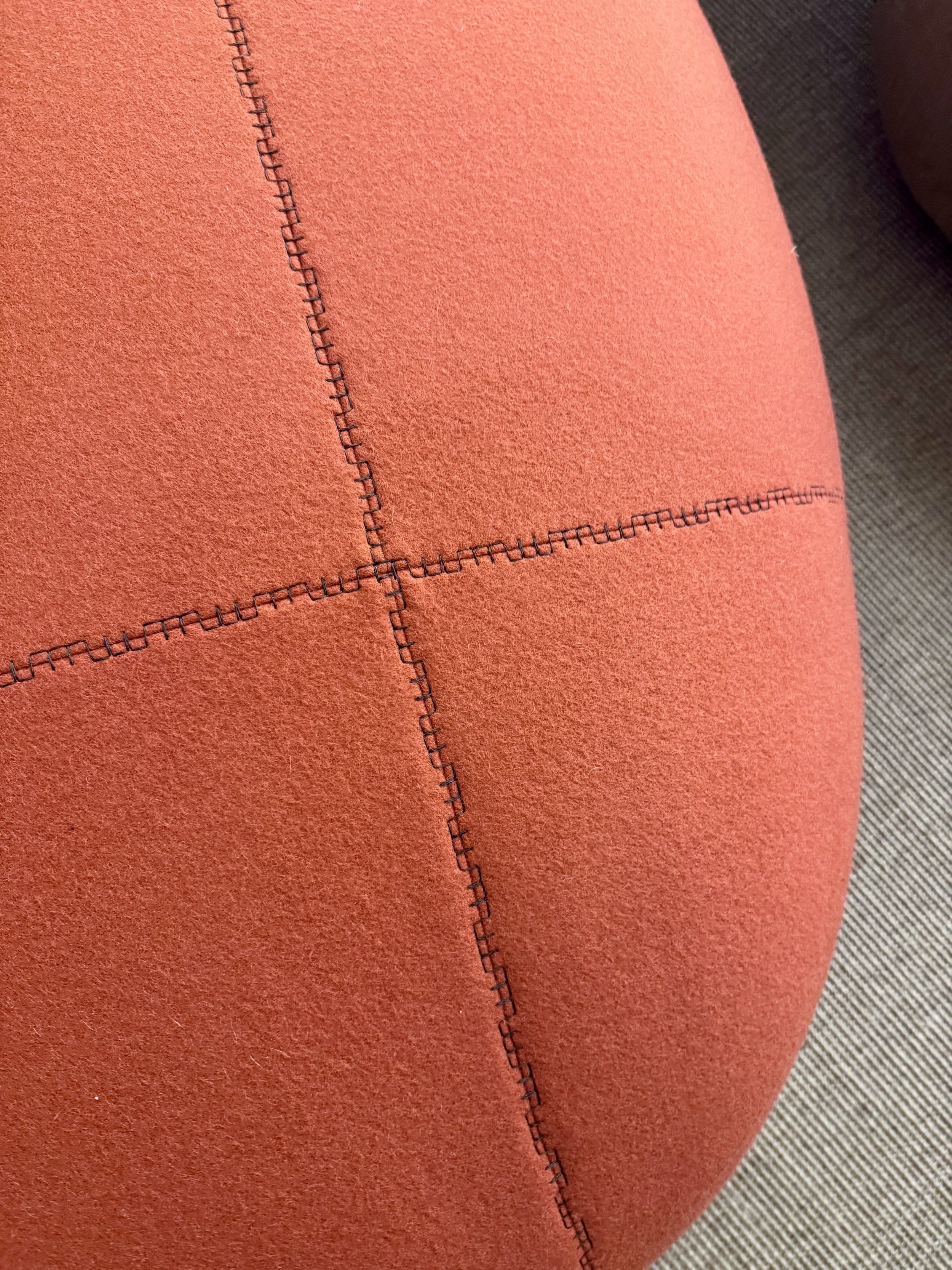
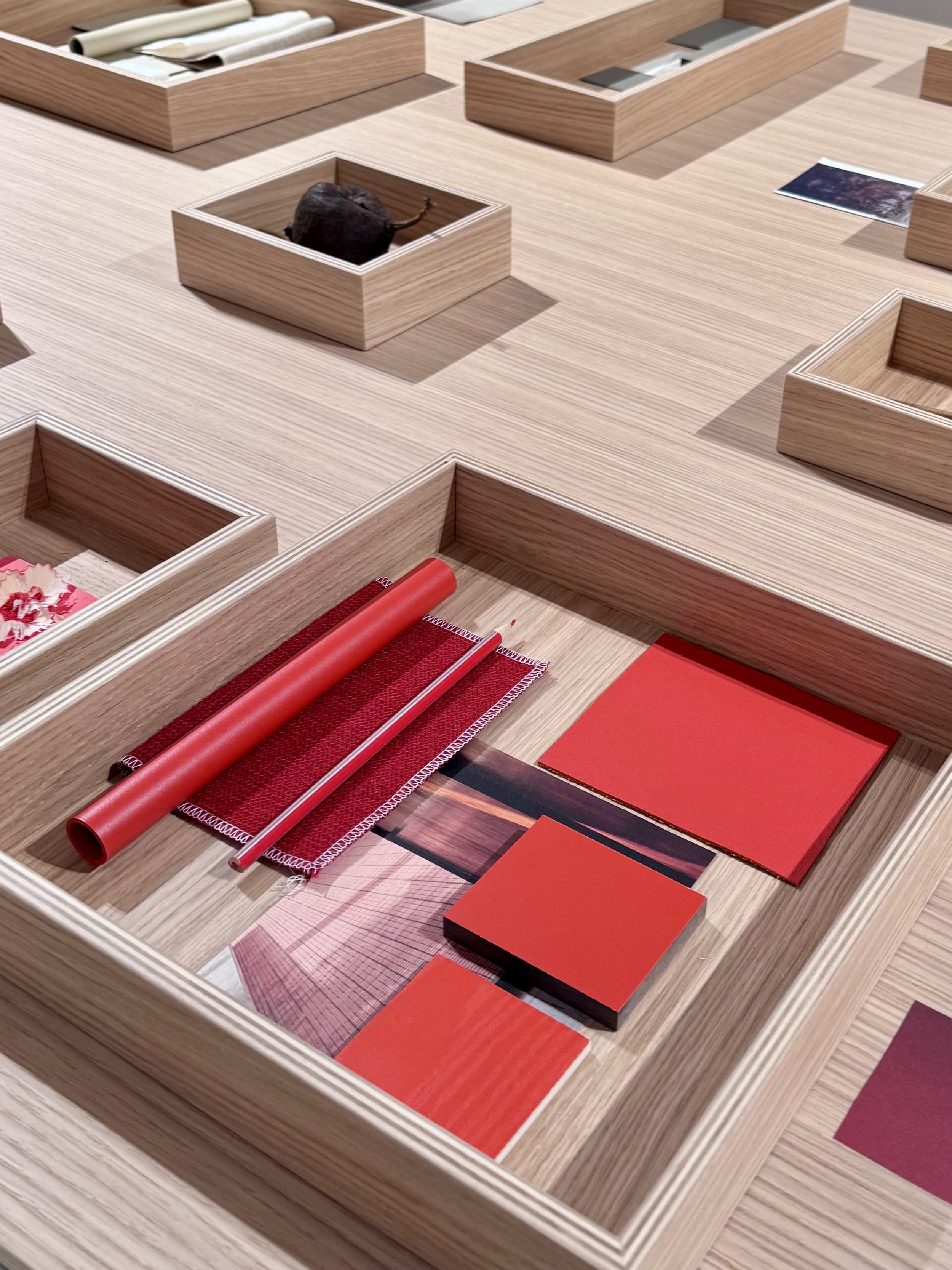
There was also a material richness to many of the applications. Densely woven fibers at Paola Lenti. Glossy and sculptural moments at Kartell. Mineral and oxide tones in the tiled works from Mutina and Sara Ricciardi Studio. Even the small moments, sample boxes at Lapalma, stitch details at Living Divani, studies on the color red at Salone Satellite, felt intentional and considered.
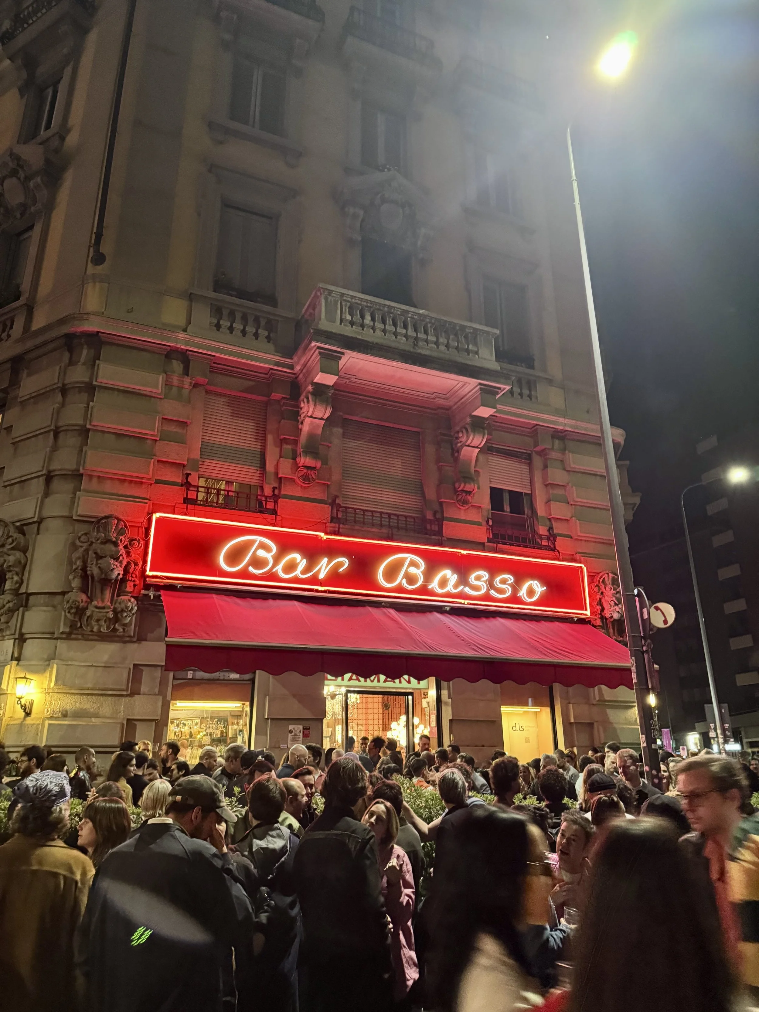
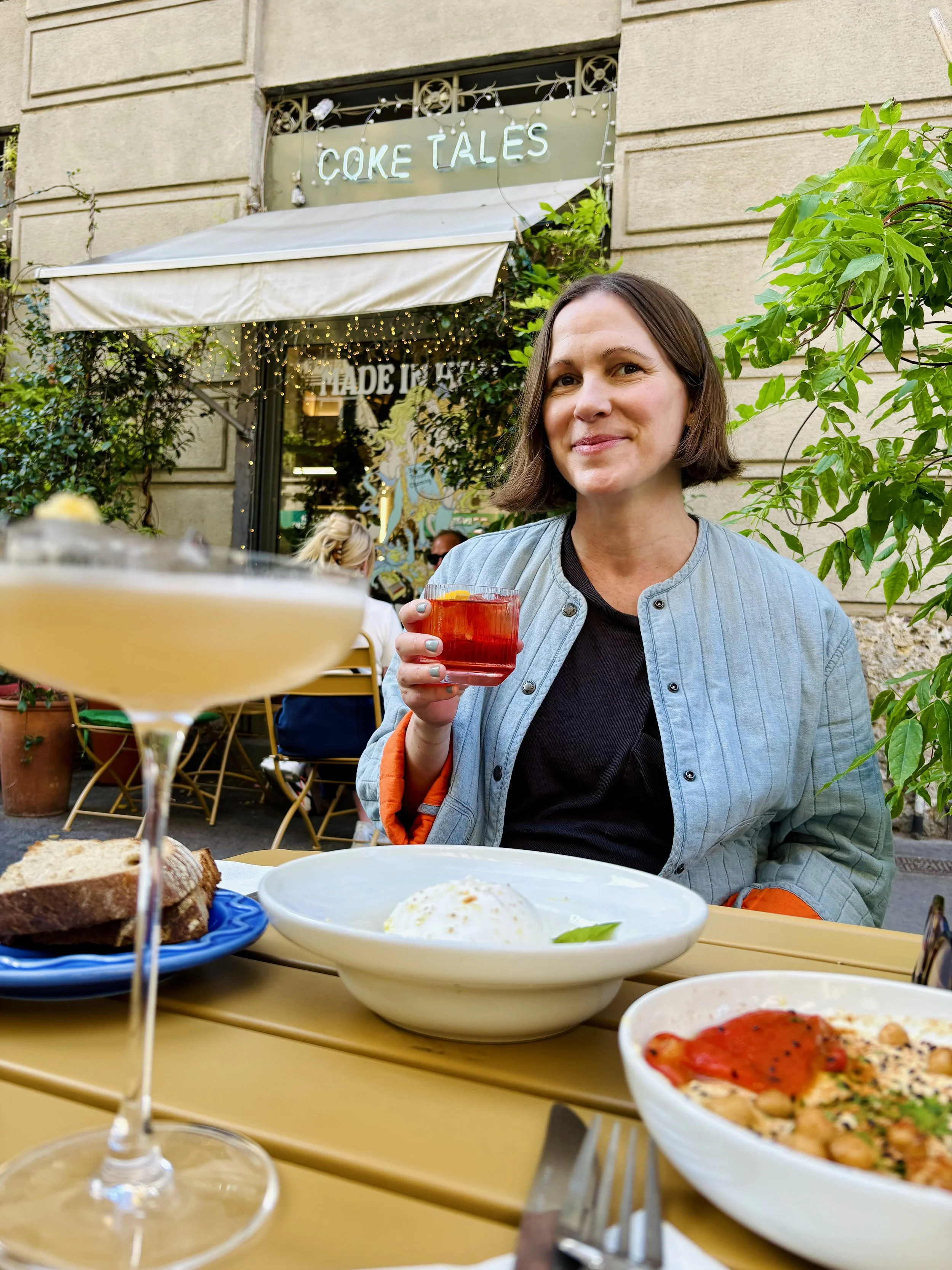
And of course, Milan wouldn’t be Milan without a few late-night negronis at Bar Basso or my Porto Venezia favorite, Coketales.
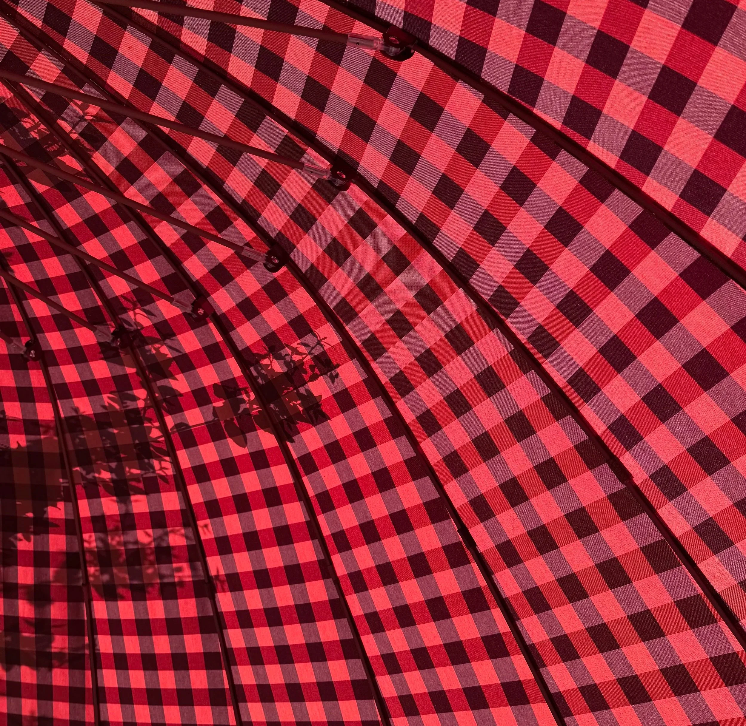
Umbrella by @paola_lenti_official